Dive into the latest industry wisdom from

our experts


Remote Work Abroad: 5 Things We Learned From Our Portugal Stay
In the flurry of recent job market trends, one, in particular, stands out - remote work. Fueled by employees’ desire for more freedom and work-life balance, working remotely has become a go-to model in many companies around the world. At Cleevio, we took remote work to the next level and went beyond just working from home - we offered our team the opportunity to work from a comfortable villa at the ocean coast of Portugal for 3 whole months!
Here’s what we learned from the experience:
Staying on top of trends is a given at Cleevio.
We keep up-to-date with the latest technologies, industry news, and developments - and it’s no different when it comes to the most recent work trends.
Two years ago, we introduced a hybrid work model. It allowed us to meet and work together in the office while providing space for concentration and deep work at home office.
The model worked great - but we didn’t want to stop there.
That’s why this year we introduced a unique company benefit: the possibility to work from a spacious villa at the Portuguese coast for 3 whole months.

Cleevio in Portugal, a.k.a. Our Workation Setup
So why exactly did you introduce remote work abroad, you might ask.
There were a couple of reasons: we wanted to improve our teams’ work-life balance, enable them to get to know each other better and combine work with play in a new setting.
So when the opportunity arose to rent a 10-people villa in the historic town of Aljezur, Portugal, we jumped right on it.
We decided to rent the villa for 3 months in the winter/spring season (February - April) to escape the cold and dark Czech winter, and enjoy a milder oceanic climate. Plus, the turn of winter and spring is the prime surf season in Portugal, and we definitely wanted to catch some waves!
On top of that, the villa offered great working conditions. Equipped with high speed Internet, spacious common areas, and a large table that fit multiple monitors, the place had everything we needed to be able to work on our projects effectively.
Oh, and did we mention the solar-heated pool and barbecue terrace?

Over the 12 weeks that the villa was available, 33 people from 9 teams visited and stayed on average between 7 and 14 days, wrote hundreds of lines of code together, and made tons of unforgettable memories!
Here’s what our stay in Villa Berenika looked like:
Remote Working Abroad: What We Learned
We’ve learned a lot from our first experience working remotely from abroad.
Here are our top 5 takeaways:
1. We stayed ahead of the trends in an increasingly remote work oriented industry
While remote work is growing increasingly more common, very often it means that employees can simply work from home.
A lot of businesses still don’t allow for remote work from a different country, be it because of their lack of flexibility, office-based culture or legal and tax issues.
That’s why offering the benefit of working from Portugal to our mostly Czechia-based employees set us apart from others. We were able to not just act on, but stay ahead of the trends, and offer our teams a truly unique experience - which is what Cleevio is all about!
2. We improved well-being, work-life balance, and creativity
After over two years of pandemic-triggered restrictions and uncertainty, it’s only natural that a lot of us were feeling strained.
The opportunity to work and have fun together with our teammates in a relaxed, picturesque setting of Aljezur helped address this issue. It provided an environment where we could simply decompress and enjoy the moment - which, in turn, translated to an improved sense of well-being and work-life balance.
The setting had a positive impact on our creativity too. After all, who wouldn’t be bursting with ideas if given the opportunity to work by a pool, at the beach, or on top of a cliff?

3. We appealed to a large pool of talents
Because the possibility of remote work from abroad is a unique benefit, we were able to stand out to potential job candidates.
Throughout the time the villa was available, we promoted it across our social media channels and in active job postings. The content featuring the villa garnered more engagement compared to other posts, and sparked questions from our target hiring audience which proves that the benefit resonated with the right crowd.
4. We enriched company culture and strengthened team relationships
This year was the first one where we introduced the opportunity to work remotely from abroad. And we quickly noticed how much of an impact it had on our culture. It allowed our teams to get to know each other better, experience new things together, and make great memories - all of which strengthened our bonds and friendships.
The Portugal villa became a popular topic at Cleevio. The visitors have started their own Slack channel where they shared activity updates, photos and videos of their stay on a daily basis. There were also lots of stories shared in person in the office which made us all feel a part of this adventure.

5. We got the job done!
Even though we were almost 3,000 kms away from Cleevio’s headquarters in Prague, Czech Republic, we stayed focused on our projects and got the job done.
Yes, we had access to a pool, barbecue terrace, breathtaking views, and perfect surfing waves - but all of this did not distract us from our goals.
We remained organized and aligned on our top priority: helping our clients grow and succeed, no matter where we are.

The Takeaway
Being able to work together from Portugal was a great experience that taught us a lot.
Staying ahead of the remote work trends, appealing to new talents, and enriching our company culture were just some of things that the “Portuguese workation” allowed us to accomplish.
Without this initiative, we wouldn’t have learned as much about our company and each other - which is why we’re glad that we’ve taken this step.
If you’re not sure if your business should go remote in a different country, we would say a strong yes! Test the idea and see how it works for your business, and who knows, maybe it will become a new staple in your organization?

What Is a Soulbound Token?
If I told you that there is going to be something opposite to the NFT called SBT… What would you say?
In May 2022, E. Glen Weyl, Puja Ohlhaver, and Vitalik Buterin published a whitepaper titled Decentralized Society: Finding Web3's Soul. They represent the DeSoc (Decentralized Society) and the Soulbound Token (SBT).
Let's take a look at what a Soulbound Token is.
To explain the mechanics of a Soulbound Token, it is best to compare it to an NFT. If you own an NFT, you can sell it. You can send it to your friend. If you decide you want to buy an NFT, you can just buy it.
The idea behind SBT is that you can't buy it. You can't send it to anyone. Only someone else can issue an SBT to you - Soul accounts exclusively can issue SBTs to each other. The SBT can also be removed by the Soul account that issued it.
Let's summarize what a Soulbound Token is:
It can't be bought.
It cannot be sent to anyone (non-transferability).
It can only be issued by one Soul account to another (the idea is that users should have multiple Soul accounts, for example a medical, work, or education account, etc.).
It is possible to remove a Soulbound Token from the account that issued it.
As with the NFT, it is a blockchain token.
What are the use cases of Soulbound Tokens?
Education degrees
Imagine a world where you have a Soul titles account that would enable anyone to verify if you have actually graduated from a given school. There would be no need to prove your diploma validity. The diploma could not be falsified. It would simply be possible to confirm if a diploma was issued by, for example, Harvard University.
Certificates
After taking a course, you wouldn’t receive a paper certificate, but an SBT would be issued to your Soul account. Driver’s licenses, ID cards, etc. could all actually be SBTs. The state would have its own Soul account from which it would issue SBTs.
Medical records
In the case you change doctors, there would be no more need to forward your medical records from one doctor’s office to another. Instead, all of your medical information would be stored in your Soul health account - not accessible to the public, of course.
Job records
Imagine a digital resume with a confirmation of your job tenure from all the companies you’ve worked for. It would be impossible to introduce changes to the confirmations, so there would be no false information about past employers and experience.
A few more ideas
Birth certificates
Olympic medals
Criminal records
Albert loyalty points 🙂
Your imagination is really the only limitation to where and how such a token could be used.
What happens when you lose your Soul account
The solution could be the so-called social recovery. Simply speaking, it means choosing the people or organizations you trust in your immediate area. These entities will then own the private keys to your Soul account.
In the event that someone steals your account, the entities will be able to recover it. Of course, if they "died out,” you wouldn’t be able to get into the account. It is not a 100% problem free solution.
The Takeaway
If you're interested in SBT, be sure to read the above mentioned whitepaper.
The idea of SBT sounds very interesting to me and even though it might seem sci-fi now, I believe the future is digital and a fully digitalized world is inevitable.
So far, SBT exists as an idea and no technical details have been specified. According to an interview with Vitalik Buterin, SBT should appear at the end of 2022. Will it become another big trend? Who knows. But you definitely can’t go wrong by exploring SBTs now.
What do you think about SBT? Can you think of any other use cases for it? And can you imagine that it will become the norm over time?
Fun fact for the very end: As Vitalik Buterin revealed in one of his tweets, the name Soulbound comes from the game World of Warcraft.
Disclaimer
This article was originally published on David Tilšer ’s LinkedIn profile. Follow David on LinkedIn and Twitter for more blockchain insights and articles.

The Power of Static Dispatch in Swift
Apple has made considerable claims about how fast the Swift programming language is supposed to be, stating e.g. that it is up to 2.6x faster compared to Objective-C.
The details of tests behind those claims were never disclosed and those who verified them themselves found quite opposite results – Swift can be by an order of magnitude slower compared to Objective-C when the code is non-optimized. With optimizations, it is still usually slower, but the difference is not as great.
In his book, iOS and macOS Performance Tuning, the software engineer and researcher Marcel Weiher found that there is a way to make Swift run much faster – but one would lose all the convenience Swift brings while going into pure C or C-based functions.
At Cleevio, we strive to write code running as fast as possible while also maintaining convenience, safety, and readability. Swift is therefore great for most of our use cases (although we also made a C-library for a computation-intensive task for one of our projects), as it meets our needs without having to go pure C-blast.
There are, however, many ways to tackle certain code problems, some more and some less performant. This article focuses on the difference between static and dynamic dispatch. We'll look at it in code and cover the performance implications of its use. We will also discuss the limitations in situations when it’s much less convenient to write the code optimally.
Static Dispatch
Static dispatch describes a situation in which we know what function body will be run in compile time. It’s usually represented by a concrete type or generics.
It could be shown in the following example:
Here, we can be sure that DinnerServer will be the one executing the function and the value we will receive is true. The same applies to classes that are notated with final keyword – they cannot be subclassed, so we are sure during compiling what will be executed.
We can see similar results when we use generics that take advantage of Swift protocols to the limits. Generics are an essential part of making an app with Swift, as the language itself was described to be a protocol-oriented language. Let’s define a protocol first:
Now, we will make a conformance of DinnerServer to this protocol. It is a simple task as the DinnerServer already implements the function.
Let’s say we have a function that takes a Server as an argument and returns the information whether the food is ready. It could be defined like this:
In current implementation, however, we say that it could be any Server. We will get the results, but we don't know what type will do the function and as any Server can be used as variable in the function, we do not even know whether we will receive true. Fortunately, there is a way to tell a compiler what type will be responsible for executing the function using generics.
Here we provide T: Server to the function. This syntax in angle brackets means that we do not expect any Server, but one in particular. The compiler would then create separate versions for every type that we provide in the function in our codebase. So, this will be a very slow margin increase in the size of the compiled application but we can be sure that the execution will be fast, as the compiler would create for us a function that looks like the following:
We can’t see such a function in our codebase, but I present it to you so that you have some mental image of how the compiler can benefit from generics behind the scenes.
We would of course be able to do the same – just declare the isFoodReady(server:) function for every type that conforms to the Server protocol, but that would be an unreasonably wasteful use of our time. Writing it ourselves would also be more error-prone as it would be easy to forget to create it.
Also, it seems feasible when we talk about one function that we would need to create. But what about some more complex code? For example, if we change the Server protocol requirements to include also prepareIngredients and finalizePreparation functions
and then extend our DinnerServer so that it still conforms to the Server protocol:
We can then create a special function for preparing food that takes care of calling both functions like this:
As you saw in the implementation, finalizePreparation for DinnerServer is empty, as our server does not need to do anything more than just prepare the ingredients. But some other Server may need it.
We can now use this in a different function (orderFood) that should crash if the food is not ready after it is supposed to be prepared:
As you can see, if we were to create functions for specific types, the amount of code we would have to write would turn exponential
together with the growth of the number of functions or the types using them.
Generics also help the testability of our code as we can create mocking types just for testing purposes without the need of creating specific functions for them to use.
Dynamic Dispatch
Dynamic dispatch is the exactly opposite situation - we don’t know what function body will execute in the compile time. So, we cannot help the compiler to create the same optimizations as it can when we use generics.
I have already presented how the dynamic dispatch function would look like in our setting. It would be a function that takes any type conforming particular protocol Server:
The result here is that it requires more work during runtime to execute this dynamic isFoodReady. Assembly code from the compiler tells the story. First of all, generic and non-generic functions have differences in their implementation.
As we can see, there is a special call to __swift_project_boxed_opaque_existential_1 in the non-generic function as this is what we have to work with – existentials. Also, in the calling place of those functions, we can see differences.
Calling our generic function is a quite straightforward code:
While when we try to call our generic function, things start to look more messy:
Most notable difference here is that there is an additional call to execute function __swift_destroy_boxed_opaque_existential_1. This additional overhead is what causes the code to run slower. How much slower? That will come in the next section.
The existential is also the name we can see in Swift 5. 6. context that introduced existential any. It’s just a way of Swift that tries to force us to declare any before any protocol type that we want in a function (for example). This approach should make us more aware of using dynamic dispatch. We can expect to get a warning or error in the future versions of Swift if we don’t use the word any in our codebase. The above-mentioned code would look like this:
Just that simple. All it takes is to add the word any.
Another example of dynamic dispatch would be a class that is not defined as final. The compiler cannot be sure what class is provided to the function – is it the class that is defined in the function, or one that inherits from it? When the class is declared as final, inheritance is no longer possible and the compiler can then create other optimizations. The same applies to specific functions or variables. If declared as final, they cannot be overridden and the compiler doesn’t have to use dynamic dispatch.
Why would anyone use dynamic dispatch then? We will look into that in the section titled Limitations where I’ll show you examples where static dispatch may be – at least – inconvenient to use in some situations.
The Results
In general, we can expect dynamic dispatch to be slower than the same functions that use static dispatch. Those are indeed the results. The question here would be – at what cost? And the answer differs based on whether we are talking about generics or final classes.
Measuring
I will present the results of using static versus dynamic dispatch. For the measurements I created a library that takes functions defined in a type called MeasureFunc (containing function and its name) and the number of repetitions.
It is very straightforward – it repeatedly runs all functions and then appends the result to a dictionary, which is then sorted and the results are then handled – the library can print them as well as save the results as CSV, for example. The average time of each function is then calculated as a mean of the runs, using CAMediaCurrentTime which is much faster to create than Date and should therefore be more precise.
I will show you the results in relation to the fastest function – so, for example, if one function would take 1 minute and the other would take 2 minutes, the first function would be shown as index 100% and the second as 200% – as it takes 2 times more time to execute it.
The code was compiled with release optimisations, but we can expect it to be much slower without them.
I use TestingClass function for all tests that I will present to you, which is declared like this:
It conforms to a protocol Testable, that has only one requirement – to support init without parameters. I’ve used UUIDs because they take some time to generate even though they are value types.
Appending Class to an Array
Code reuse is one of the great ideas of modern programming. We don’t want to repeat ourselves and we want to change, if possible, only one line in one place, instead of one line in multiple places.
First example when I tested statically and dynamically dispatched code was with adding our TestingClass to an Array. Yes, it would be faster to add it to a ContiguousArray, but – let’s be honest here - nobody uses that (and even I do it only sometimes).
The code to add to an array is very simple for generic type, as it is declared by taking one item and appending it 100 000 times.
Using a dynamically dispatched function changes the code, only that we use Testable directly instead of T. With Swift 5.6. we would use any Testable.
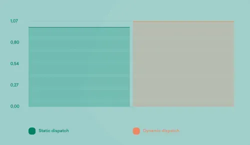
The results are not surprising – it is much faster with generic function. How much faster? By about 62%.
Appending Class to an Array with Initialisation
Sometimes, we may need to not only append one specific item to an array repeatedly, but also create it based on some data and create a model from it. The initialization itself would therefore take some time. And even though the appending would be much faster (as we said before, by 62%), the total time of the function should be much lower as the init time should be the same.
The functions are very similar to just append to an Array, with the only difference being that we initialize it when we append it. The generic function looks like this:
While dynamically dispatched looks like this:
The results support what we expected, using dynamic dispatch is 7% slower than using generics, because significant time is used on the creation of the class. If it wasn't a class or didn’t have 5 variables, the dynamic dispatch would be relatively slower (but never more than the 62% that we showed in the previous test).
Class Recursion
We’re not going to talk about any recursion algorithms (that are usually not even the most performant way to perform tasks). Here, I will show you a very simple code of some class that takes a parameter and then in turn hands over that parameter. The usage of such may be some dependency injection – like in coordinators or possibly in some SwiftUI ViewModel handling.
Recursion using static dispatch looks like the following. As you can see, we start with some item that conforms to protocol Testable and then recurse 5 times (starting from 0).
Dynamic dispatch looks very similar, the only difference is that we declare storage to be Testable instead of Generic T.
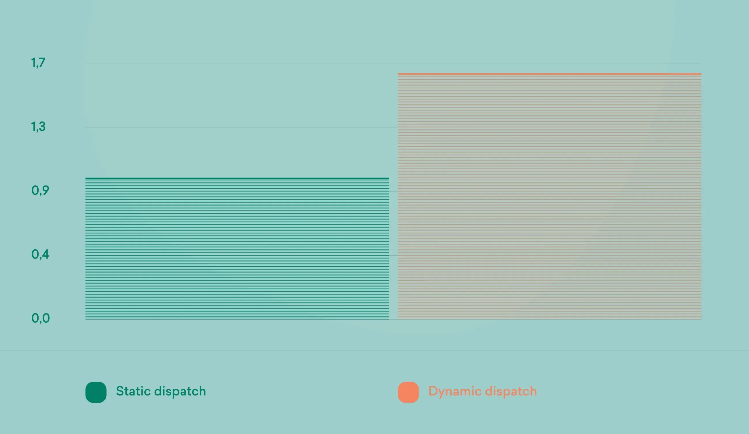
Again, static dispatch is much faster, in this case by 67%.
Final Classes
I found only a minute difference when I declared classes as final. But it is definitely a part of Apple’s optimization tips you can find on their Github . I haven’t focused much on benchmarking final classes in tests for this article, but we can see that we can gain a little when we use final classes to improve not only our runtime, but also compilation times.
I recommend this great benchmark from Swift forums done by Jon_Shier that shows that declaring classes as final can bring us around 1% of compilation speed. Not bad, right? And since using generics takes a little longer, we could gain what we lost. At least partially.
Limitations
Our iOS architecture is based on MVVM-C. We first provide dependencies to Coordinator, which is then responsible for creating ViewModel, ViewController, and then attaching ViewModel to ViewController (on View, depending on whether it is newer app that uses SwiftUI or older one built purely on UIKit).
It was fairly easy to start taking advantage of static dispatch in coordinators – As instead of:
We now use generics declared as:
That code is even shorter as it’s not necessary to create typealias for Dependencies to use later in functions of coordinator, so that whenever we would need to change the dependencies, we would change it only in one place.
One of the tidbits here is that whenever you try to go for this change of taking generics instead of any existential, you would have to change it in all places – or at least start with some root coordinator and then continue down with the flow. To showcase this, let us declare a protocol Developer:
and a type conforming to it:
This code compiles:
But the following doesn’t. It is due to generics expecting a specific type – and the compiler cannot make a specific type out of existential.
But it's not as easy when we work with ViewModels and ViewControllers. If ViewModel were generic, it would have to be specifically declared in ViewController using Generics as well as in ViewModel itself (you can see it in the following example in the angle brackets where we have to duplicate the code). We would then have to declare what protocols ViewModel conforms to in ViewController, which would then be little harder to refactor when needed.
It’s also not possible to extend a class to be a delegate for objective-c API when that class uses generics, as can be seen in the following example where we’re getting the error „Conformance of generic class ViewController<T> to @objc protocol UITableViewDelegate cannot be in an extension). Yes, it would be possible to solve through another object that would serve as that delegate, but that would require significant changes.
Generics can also become highly complex when we want to have default arguments for Generic dependencies. It’s very easily seen as the context of SwiftUI, but applies to any context that uses Generics. To showcase this, let us create a very easy ContainerView that has two attributes – content and its overlay.
So, what if we want to create some default arguments for it? We would have to extend ContainerView with them. Let’s say that we want to have a default argument for content to be Text and for overlay to be EmptyView.
For Content it would look like this. You can see where Content == Textwhere we declare that this is an extension that applies only when the Content is Text. And also in the init, there is Text with a localized string of „Placeholder“). So whenever you would use ContainerView(overlay:) init, it would show the Text with Placeholder string.
And for Overlay to be by default EmptyView like this. The result is that we can now omit the overlay parameter:
But, what if we wanted to have an init that has two default arguments, Text and EmptyView? We would then have to declare another extension like this. This approach allows us to combine previous two extensions and declare the ContainerView only as ContainerView() without the need to specify any argument:
But what if we had some other arguments that we would want to default? As you can see, the complexity would be exponential here. For two default arguments, we need 3 extensions. For 3, we would need 7 arguments. Here, the discussion should also be about the maintenance, whether a pure Generic approach is suitable from the beginning when the API or app architecture is not finished yet, and might be changed significantly in the future.
It’s worth adding that there’s just no way around it in some places if we decide to use generics. Apple uses exactly the same for their SwiftUI elements. While we can’t see the actual implementation, we can see the headers and names of the functions in the documentation.
There are two arguments for SwiftUI.Label – for Title and Icon. And as Apple wants users to be able to use some convenience inits, they also have two additional extensions (as Apple doesn’t have any default parameters here) containing convenience initializers. For example, in the first extension where Title is Text, there are convenience inits to take String, LocalizedStringKey, as well as String for image or SF Image. As you can see, there is no way to initialize a Label with some View but also a String of an image – that would require them to create another extension. The same applies to the case where we would have Title as a String but Icon being some View. Making API is just hard and you either provide all the convenience inits or make your life easier.
These limitations are definitely not finite. Depending on the context, there may be ways to overcome this. If you have any good examples of limitations or how to solve them, please let me know!
Swift 5.7
Apple has brought many great additions to Swift 5.7. They significantly improved how we use generics and deprecated some of the limitations I mentioned before.
For example, we defined a following function in the first chapter of this article:
In Swift 5.7., all it takes is to write it as following:
The angle-bracket approach that might have frightened potential users of generics is gone – with the use of the same some keyword we know from SwiftUI, now also in a parameter of a function.
I also showed how hard it is to define default arguments for parameters in SwiftUI. Not anymore. For our use case, we needed 4 inits. All it takes in Swift 5.7 is to have one of them.
And most interestingly, it is now possible to use something people from Apple call existential unboxing. What does it mean? We can now use an existential in a generic function. I think it sufficiently illustrates following example:
As you can see, you can have an existential any type that can call a generic function, which – as it always could – then calls an existential function again. This (with the other additions) is the reason why my presentation for team about generics in Swift 5.7. and how to improve our code with what’s to come was called Big Year For Generics.
From Swift 5.7. we can gradually adopt using generics in code, as it is not necessary now to update the whole coordinator hierarchy if we want to start using generics. We can start with just one and continue along the way.
Swift 5.7. therefore greatly improves what we already had, while the previous code still compiles. Just beware of switching to Xcode 14 too soon, it is by no means stable and has serious issues as of the time of writing the article.
Final Thoughts
So, what to take from this article? Try to use the power of static dispatch whenever possible. Swift is a great language for the coder, although it is very compiler-intensive. And the compiler needs help from us, which we can achieve by using generics, final classes, or even some private and other declarations.
But be careful about over-optimizing. As I showed in the Limitations section, there are situations in which it would require significant refactorings of current code – and may make it harder if we wanted to refactor that code in the future. Always think about feasibility as well, as you may burn a lot of your – or the client’s– time to optimize some code. And even though there are significant performance implications, our phones, computers, and tablets are so powerful nowadays that they may not be noticeable to the user. It’s great to optimize whenever possible, as it may even save some battery life, but don’t overdo it.
Finally, I wanted to share some pieces of practical advice. I believe that your code that uses existentials without any will get you a warning from the Swift compiler in the future – and when it does, think about making it generic instead of inserting any in there. When it comes to classes, you can for example use the following SwiftLint rule for getting a warning if your code contains a class not declared as final (as you can always disable the rule for classes that are to be subclassed). You can of course change it however you like, in our case, we use it only for Managers, Services, and Coordinators.
GoodTrust: Navigating the Digital Legacy Landscape
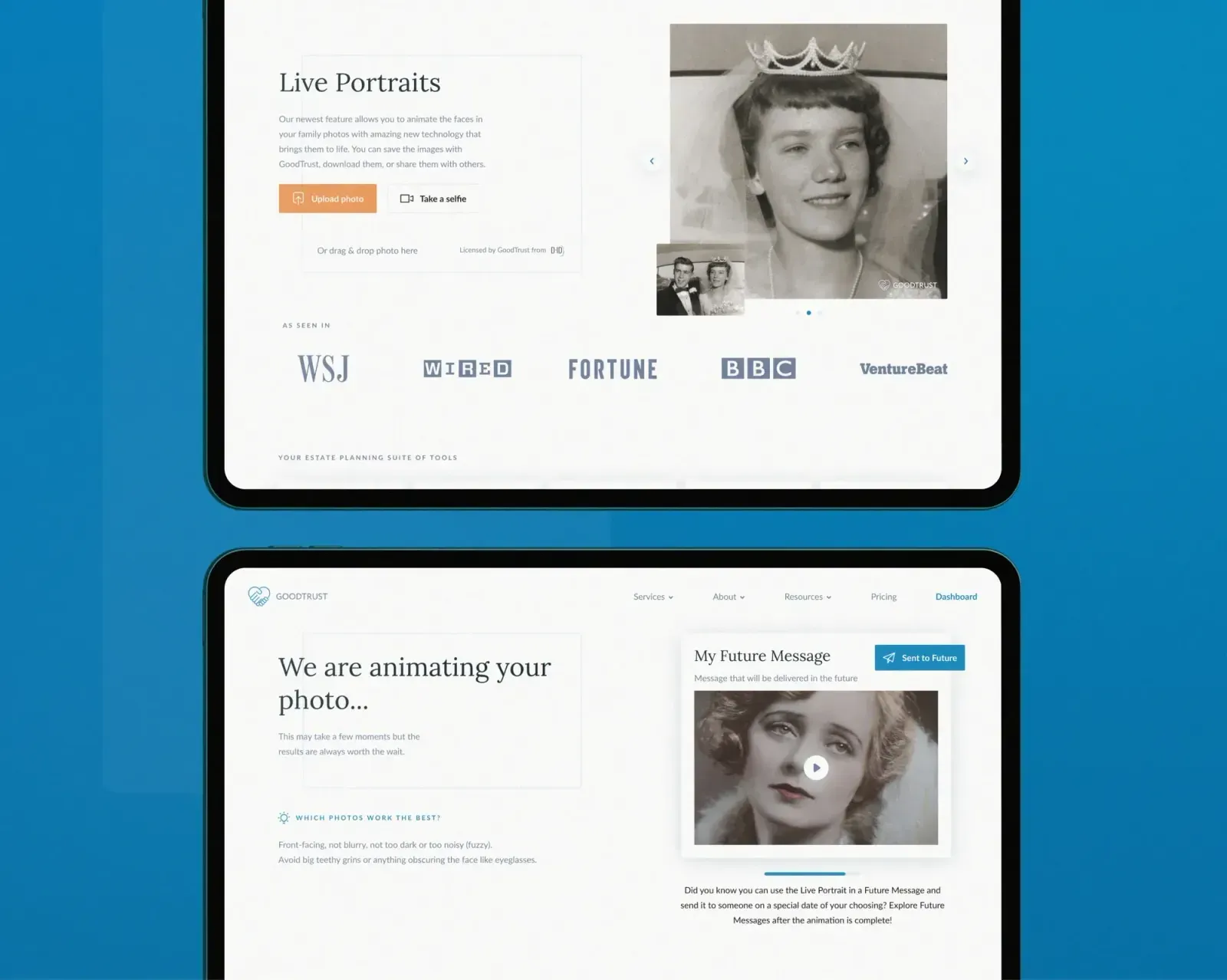
The founder of GoodTrust Rikard Steiber found out how difficult it can be to manage someone’s estate after friends died during the pandemic. He witnessed the family members struggle to complete tasks such as closing social media accounts, securing photos, and dealing with financial services accounts. This was the main reason why he decided to start a GoodTrust - a digital legacy management company that can handle your digital affairs after you die. That might sound pretty dark, but since we’re all going to die someday, we probably don’t want to leave our family and loved ones with a big mess to fix.
It’s actually pretty difficult to locate all the digital accounts and then also to close them down or actually extract content or money from them. If you think about all your emails, documents, subscription services, your banks, your insurance, your social media — that’s a lot of digital stuff, which means that if someone dies and hasn’t thought about it, you’re not going to be able to access most of these things.
Some of the tasks that GoodTrust can take care of include: setting up a memorial page on your Facebook account; stopping subscriptions that charge you monthly fees, like Netflix and Spotify; and closing down accounts that are no longer needed, such as LinkedIn or Instagram. It can also discreetly close accounts that you might never want to be discovered. And it can rescue the family photos and videos you want to be saved for posterity.
What makes GoodTrust different?
Compared to other similar services, GoodTrust handles all of the legal, financial, and emotional legacies heirs typically have to deal with. GoodTrust plans start at $40, and the service can lockdown more than 100 sites. In more expensive plans, it can even get court orders to gain access to accounts that require such measures. The company can also handle Facebook memorialization for first responders and their families at no cost. In a 2020 survey, GoodTrust found 90% of U.S. adults do not know what happens to their digital assets (emails, photos, social media, online banking, sites/passwords) when they die, and 84% said they would use a secure online service to transition those assets when they die.
150,000 people die every day globally and while each tragedy affects loved ones on a personal level, it also means the number of deceased people on the internet is growing rapidly.
Shuttering an account on someone else’s behalf is made more complicated by legal requirements that vary from site to site. Retrieving personal photos from a loved one’s account on Google, Apple, or Facebook requires expert legal knowledge and a court order. The companies aren’t trying to make a survivor’s life difficult but they simply can’t turn over an account to someone claiming to be a survivor when the “dead” person was still alive.
So why should you care about your digital assets after you die?
When your accounts lie idle, your information is at risk of being lost forever or even hacked, If you don’t do anything, then you can’t really control what’s being posted on Facebook such as some inappropriate pictures, or you get inappropriate birthday greetings, which no one really wants to receive after all of this.
This of course, becomes even more difficult when money is involved, such as a Coinbase account for cryptocurrency or a Robin Hood stock-trading account. Not only do you have to prove the owner has died, but you also have to prove you are the rightful heir which can get tricky.
The issue of trusting a company with secrets and passwords is a pretty big one. GoodTrust doesn’t need the deceased’s user password to memorialize Facebook, stop Netflix subscriptions, delete LinkedIn accounts, extract photos from Google Photos, and so on.
The way it works is that customers give GoodTrust power of attorney and all the documentation required by the websites. GoodTrust does not have access to customer accounts, nor does it see any of its content.
The company tries to handle a lot of this through automation but in some difficult cases, GoodTrust offers a “white glove service,” and the company will add more such services over time. Things like a password manager may capture all of your sites and passwords, but you probably don’t want to hand this over to someone else.
The best way to protect the digital identity of a deceased loved one is to take control of their digital accounts (or delete them), as this prevents hackers from taking over forgotten accounts or impersonating a user for scams.
The People Behind GoodTrust
GoodTrust’s founding team includes serial entrepreneur Markus Thorsveldt (chief technology officer), Olivia Gorajewski (chief operating officer), and Christian Lagerling (chief financial officer). Former Google employees include Scott Levitan and Daniel Sieberg. Advisers include Kallayil and Google ads research engineering VP Tony Fagan. Steiber was previously president of Viveport and senior vice president of virtual reality at HTC, which makes the Vive VR headsets.
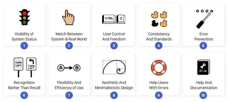
10 Usability Principles Every Designer Should Know
What are the Usability Principles?
25 years ago, Jakob Nielsen described the 10 general usability principles for interaction design. These principles were developed based on years of experience in the field of usability engineering and they’ve become rules of thumb for human-computer interaction.
Today, they are just as relevant as they were then. These usability principles can help to save development teams considerable amounts of time during early usability testing so that they can direct their attention to more complex design challenges. In addition, it’s also worth it to use them as a checklist when designing a new product or a feature.
Also, do not forget to check out Cleevio's latest design articles: 7 Tips For A Great UX Survey Result, Understand Your Customer Needs With The Kano Model.
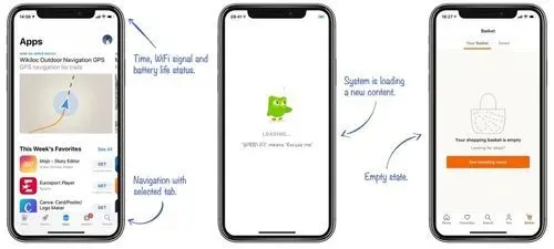
Visibility of System Status
People love to keep things under control, and only then they can feel secure. From the evolutionary point of view, a need for safety and for physiological needs (like food, sleep, and sex) helped us to survive. The sense of control can be evoked by providing information about the system status and feedback after every interaction.
Take a look at your smartphone. Right after the screen lights up, it informs you about its battery, a wifi connection, received messages, missed calls, and much more. Imagine how insecure you would feel if this information were missing. By utilizing signs, icons, and indicators, the system communicates its status and helps user make better, more informed decisions.
When people interact with any system it should always provide immediate feedback on the interaction. Each of us have been burned by a bad experience in the past, which has left us sceptical and suspicious a priori. Just a visual sign like the change of the button’s colour, a loading spinner or an icon animation can help the user to understand what’s going on and prevent them from other unnecessary interactions.
The Match Between The System And The Real World
People are approaching every new system with a mental model in mind. In other words, people presume how the system could work based on their experience with other systems that are similar. By using language that they are familiar with, you can help users overcome the initial awkwardness.
An extreme example is a skeuomorphism design, which transfers all details of real world objects into the software. At the beginning of smartphone adoption, it helped people to learn how to use their new companions through the aesthetics and processes they were familiar with before.

Great examples of real-world matching icons
Even in today’s minimalistic world, dozens of design clues persisted from that era: apps like the compass or the calculator, or design components like folders, toggles, or lock icons. In addition, language and concepts from the real world help users to easily understand the system. That’s why the app for storing cards is called “Wallet,” we’re using “Bookmarks” for saving our favorite websites, we use the “Trash Can” to remove old files, or the “Shopping cart” while shopping online.
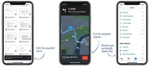
User Control And Freedom
People often interact with the system in a hurry, and often times, they’re not even fully concentrated. This results in things like misclicks or other accidents which might be frustrating. Imagine a situation that involves something like accidental deletion of an important file or posting a grammatical mistake on your company’s social media; every system should have a clearly marked “emergency exit” mechanism, that provides users with an easy way back after they find themselves in an unwanted state.
“Every system should have a clear emergency exit.”
An appropriate emergency exit can be something as simple as an arrow back (e.g. in a browser), a trash bin, which protects us from accidental deletion, or the “undo” button, which lets the user to revert the last action. All of these examples demonstrate systems which don’t let users down when they make a mistake, and instead, they allow the user to fix it.
Consistency And Standards
Have you ever noticed that the copy-paste functionality works exactly the same, no matter what app you’re using? What about the fact that you can get on your home screen by simply swiping up from the bottom edge? These are just two usability patterns that Apple uses to make their system consistent and predictable for users. A comprehensible system should never confuse users by using different words, visuals, or actions for the same concepts.
“Don't forget that people spend 90% of their time interacting with other apps.”
A good starting point for a consistent design system of your mobile app are both Apple‘s Human Interface Guidelines and Google‘s Material Design Guidelines. They present a solid foundation that describes important design components with many examples. While designing your new app, never forget that people spend 90% of their time interacting with other apps, therefore using best practices and common patterns will eventually result in a much better overall experience. Consistency is one of the strongest contributors to usability.
Error Prevention
Based on Don Norman’s book The Design of Everyday Things, there are two kinds of errors created by interaction with a user interface: slips and mistakes.
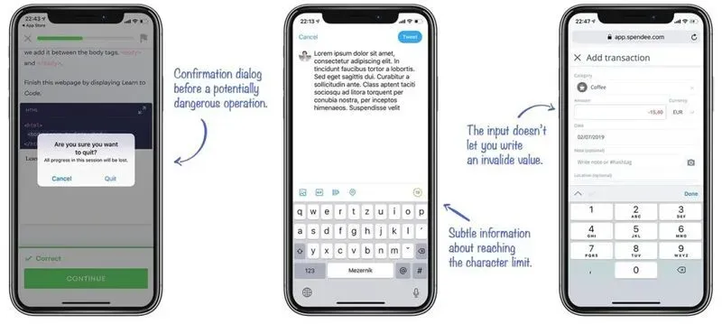
Slips happen when the user tends to do an action, but due to low attention, performs another one (e.g. when performing well known task). The strategy to prevent users from experiencing a slip is to minimize the chance of it occuring by guiding them only through the safe areas. Use constraints that don’t allow a user to set a wrong value (e.g. when you expect a number, don’t allow to write the letters), suggest the most common options to make choosing easy for users (e.g. while searching), or use confirmation dialogs before destructive actions.
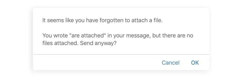
Smart slip prevention in the Gmail web app. Unfortunately, the mobile app lacks this feature.
Mistakes are often caused by a user’s incorrect mental model of how the system works. In this case, the user misunderstands the communication and consciously performs an action which leads to a different result than they intended. These kind of errors don’t often come with an easy fix, and they should be revealed during the user testing phase. Use clear communication and a consistent design system to prevent mistakes.
Recognition Rather Than Recall
There are two types of memory retrieval: recognition and recall [5]. The recognition happens when you easily recognize a person or an object that you’re familiar with. It is a very shallow form of retrieval from memory and it doesn’t require any work. The recall happens when you have to find rarely used information in your memory (names, years, details, etc.). To recall information, people have to activate more memory chunks. Therefore, the recall process is a deeper retrieval and requires more work. (That’s why multiple-choice questions in tests are much easier to answer than open-answer questions.)
A good user interface doesn’t require the user to recall frequently. Instead, it offers all options and information required to make a choice. It’s much easier to quickly scan through icons or a text menu and select a coveted feature than trying to recall it from your memory and then write it into some terminal-like text interface. Give users clues for remembering information, and provide an icon next to the feature name or use a specific color for related functions. Well designed information architecture also helps with a hunt for information.

Users who are not familiar with the syntax of terminal commands can’t perform as easy operation as opening or deleting the file.
Flexibility And Efficiency of Use
Every user is unique; each have their own different needs and skills. Equally, every task is unique and requires different controllers.
Declutter the screen and make the app easier to navigate. The app should always display only relevant UI elements and commands. Look at apps like Apple Pages or G-Drive apps; when you’re writing a document, you see just a few controllers related to text editing. But when you decide to add an extra chart, a whole new palette of features specifically curated to help you complete this task appears.
Don’t forget about professionals and advanced users in general! A new user who is entering a learning curve [6] will always have different needs than the professional who’s using it a few hours every day. Power users might appreciate advanced options, shortcuts, or even extendability and customization of the app’s interface. Power users need to save their time and perform tasks quickly, but precisely and reliably too. A good user interface should offer appropriate functionality to both inexperienced and experienced users.

Advanced Photoshop Shortcuts [7]
Aesthetic And Minimalististic Design
Minimalism is not only a fashion of last few years, but it certainly is a lasting trend with the aim to reduce the description of a subject just to its necessary elements. It has many applications in art, music, and literature. Minimalism helps users to quickly access important information and come to the result quickly.
”Perfection is achieved, not when there is nothing more to add, but when there is nothing left to take away.” – Antoine de Saint-Exupery
To let the remaining content stand out, you can use nothing but whitespace. It helps to increase content legibility, it highlights call to actions, and creates a balanced and pleasant look [8]. A minimal design uses only the necessary colours to support the visual hierarchy. Think about the purpose and meaning of each color. Use it consistently.
Help Users Recognize, Diagnose, And Recover From Errors
Errors and issues of any kind can be frustrating for the user. Especially when they’re poorly designed and communicated. Whether we want it or not, users always tend to get themselves into situations that they need to find a way out of. To minimize the frustration, we should put as much effort into designing error experience as we put into the rest of the system.
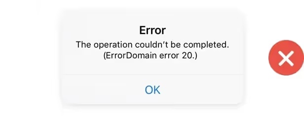
A bad example of the error message which is neither clear or useful for the user.
Every error message should be as explicit and precise as possible. Nobody wants to read vague messages like “something went wrong.” State what happened in a readable human language. Messages like “Class error 372,” are just as absurd. Give the user some constructive advice on what to do next. Propose the solution or direct the user to a customer support employee who can handle the situation. The last rule of good error messages is politeness. Never blame the user or imply that they’re stupid.
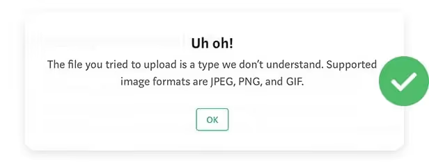
A great example of the error message which immediately suggests the next steps.
Help And Documentation
Every app should strive to be perfectly usable without any documentation, but as we mentioned before, every user has different skills and different levels of knowledge, and what is easy for 90% of your users might be difficult for the remaining 10%. Well written documentation, FAQs, and tutorials might be crucial for retaining the stunned user.
Documentation should be well structured, written in a human language, and minimalist. Sometimes, users don‘t need a whole lot of documentation; a simple coachmark showing how the new feature works or a brief onboarding guide that explains the basics is enough. Apps like Trello, Slack, and Duolingo are doing a great job at onboarding their users.
Conclusion
Here at Cleevio, we've designed over 120 digital products and those 10 usability principles have been used in the design of each of our products. Also, Cleevio has recently been announced a Winner of Mobile UX Awards. So if you are wondering about designing a new product, feel free to reach out to us as we are happy to offer you a free consultation.

Understand Your Customer Needs With The Kano Model
With all the ideas and feedback coming from your customers, colleagues, and stakeholders it might be hard to calm your mind and focus on the actual customer needs. For every customer-centric organization, keeping customers satisfied is non-negotiable. But what features will make your product as right as rain? And what’s this secret sauce that gets your customer needs satisfied?
Don’t find customers for your products, find products for your customers. — Seth Godin
The Kano Model has all the answers for you. It is one of the techniques we use in Cleevio for identifying customers’ needs. It helps to define the attributes of products and services which directly lead to better satisfaction. It was developed in the 1980s by Japanese professor Kano, and since then, it’s been widely used by marketers and product leaders from all sectors (case studies from the automotive industry, air transport, or construction companies).
Identifying Customer Needs
Relationship between feature functionality and customer satisfaction.
Customers are buying products with expectations and needs and therefore, the product's functionality and features directly impact customers’ emotions. Based on the Kano model, each product feature can be categorized by their caused effect: Mandatory Features, Satisfiers, Delighters, Indifferent, and Reverse Features. Let’s take a look at them one by one.
Mandatory Features
Also called “must-haves” or “basic expectations”. These are the baseline features of the product that satisfy the basic customer needs. They take them for granted and as a characteristic for its category. For example, when you buy a phone, you expect that it’s capable of writing and sending text messages, making phone calls, etc.
The presence of mandatory features does not lead to happiness or excitement, but their absence leads to a strong dissatisfaction. With the lack of emotional affect, they’re difficult to identify just by asking “What features would you appreciate?” It’s better to ask the other way around: “Would you be disappointed if the feature was missing?”
Note: At the very early stage of the product It is important to not overfill it with features. You can build a Minimum Viable Product (MVP) offering the core set of functions and add features based on customer feedback.
Performance
Among performance features, you can find user requests and features with a linear impact on satisfaction or features that express the quantitative capability of the product. It’s typically true that bigger is better.
Different configurations and implementation of these features can help to separate one product from the other and create a competitive advantage. A highly demanded feature or superior performance might work as a unique selling proposition. Nowadays, popular Freemium products such as Dropbox, MailChimp, or Airtable use Performance features as the main component of their paid plans.
Performance features increase the satisfaction level when fulfilled and a decrease in the satisfaction level when not fulfilled. Their fulfillment is often directly dependent on the price of the product.
A good example of performance features is e.g. smartphone camera resolution, storage size, or battery life. Also several questions and responses in different SurveyMonkey plans.
Delighters
So-called excitement/attractive features are often represented by something extra; special value which customers get despite their requirements. They demonstrate that someone really cares about customers and thinks about the small details that truly make for a unique experience. They show above-standard quality and exhibit exceptionality.
When delighters are missing, nobody complains. If they’re present, they might lead to a significant increase in satisfaction. These features make the difference between Viable and Awesome Products. Customers are telling their friends and family about them and everybody loves them. But be careful — delighters will only work when all the basic expectations are met first!
Customers are slowly getting used to the delighters, and they’re becoming performance features or even mandatory features over time. A good example is the car air conditioner. Originally used in the 1960 Chrysler Imperial as a sign of luxury and unprecedented quality. Today, every newly produced car has one and it’s considered a baseline feature — nothing special.
Reverse and Indifferent Features
Both Reverse and indifferent features are those you should avoid in your product. Reverse features are opposite to satisfiers — the more of them that you deliver, the less satisfied your customers will be. These features are bringing complexity to your product and harm its value.
Indifferent features are those that don’t have any impact on customer needs satisfaction or overall experience. ROI of these features is simply so bad that it doesn’t make any sense to spend resources and time on building them.
At Cleevio we've developed over 120 digital products in the past 10 years so we have enough experience under our belt, to identify both Reverse and Indifferent features so feel free to reach out to us and we'd offer you a free consultation.
Satisfying Customer Needs Using The Kano Model
Alright, now you got the basic concepts of the Kano Model. Let's take a look at how to use it. Just like for any other research method, users and their opinions are key for successfully sorting your product requirements into the Kano categories.
Step 1: Chose The Right Features and Customers
Even though your backlog might be overflowed by features from various fields not all of them are ideal for the Kano questionnaire. You should always include only the features which directly impact your users so they can easily determine how much they’d like to have this feature.
Also, don’t include too many features in one questionnaire. In past runs, we’ve found out that around 20 features should be the max for a good completion ratio and to produce satisfying data.
To avoid noise and unclear results, segment your customers using your own customers' groups, demographics, or approach to innovation. Segmentation will help you to distinguish which features are important for the whole user base and which features will delight only a small user segment.
Step 2: Data Collection
When you have a list of features, it’s time to prepare the questionnaire and get the data. In Kano surveys, every feature comes standard with 2 questions:
- If you had (feature), how do you feel? — Functional positive question
- If you didn’t have (feature), how do you feel? — Dysfunctional negative question
With the identical responses:
- I like it
- I expect it
- I’m neutral
- I can tolerate it
- I dislike it
All the tested features should be well described and ideally complemented with a picture, video, or prototype. Your users should get a clear idea of how the feature will impact their usage. Use the concepts they’re already familiar with or they can easily understand. So, rather than asking: “If your phone had 3 400 mAh battery capacity, how do you feel?” which might be too technical and unintelligible for a mainstream audience, you can ask: “If your phone could run 12 h on one battery charge, how do you feel?”
“Without data, you’re just another person with an opinion.”– W. Edwards Deming
It's possible to also include the third question on the importance of the feature. If more features end with the same results, the importance dimension can help you to decide. If you need to get some extra input on presented features, you can also include a fourth optional question with open feedback:
- How important is having (feature) for you?
- Do you have any feedback on (feature)?
This important question usually comes with the simple 5-point Likert scale: from “Not at all important” to “Extremely important,” while the feedback question should be open-ended. Sometimes, it leads to an additional interview, so don’t forget to ask for emails at the end.
Step 3: Analysing The Results
You’re already in the process of data collection and you might ask how many respondents you need. From my experience, for B2C oriented products, responses from around 50 participants from a homogenous segment can show clear trends and with 100+ participants, you get a good certainty of statistical significance. If you’re B2B oriented, responses from tens of customers will give you a great overview.
For the analysis, I use 3 simple methods that give you a Kano category for each feature, show the relations to the other features, and their potential impact on satisfaction. You can also use a calculation sheet made by Alexey Kartashev, but I strongly recommend to go through the methods and understand how it’s calculated and what the result means.
I. Discrete Analysis
The first step of the analysis is sorting all the responses into the Kano groups based on your participants‘ responses on both positive and negative questions. Use the categorization table for that purpose. E.g. if the user replies that she’d like to have some feature, but at the same time she wouldn’t mind if the feature is missing, then the feature belongs to the category of delighters.
Answers that indicate that a respondent would like to have a feature, but also like the idea of not having the feature should be categorized as a Questionable. It signifies an incorrect understanding or a reckless answering process. In the case of more questionable answers, consider improving and repeating the survey. The results would be most likely flawed.
Then, calculate the number of times when a feature was defined as a particular category. The highest consensus defines its overall category.
If one feature has the same count for more categories, pick the overall category based on the following rule:
II. Continuous Analysis
While discrete analysis gives you a quick overview of feature categories, it also lacks details, such as the opinions of respondents who fell under non-selected categories, and the feature relation with the other features. Continuous analysis, presented by Bill DuMouchel comes with the solution and helps to display all features in an easily understandable chart.
The first step is to assign a numeric value to each answer based on its impact on satisfaction. For that purpose, use the following key:
After that, you can average the functional values and dysfunctional values for each feature which gives you x and y coordinates in the evaluation table. Most of your features will probably get to the top right quadrant and this is also where you start with your prioritization. If your questionnaire contains the important question, simply use a bubble chart with an extra dimension to display the importance.
III. Satisfaction and Dissatisfaction Coefficients
A satisfaction coefficient is a number between 0 and 1, which indicates how strong the impact on satisfaction is if a particular feature is present. Similarly, the dissatisfaction coefficient shows how strongly omitting a particular feature would influence overall dissatisfaction. You can simply calculate both coefficients using the following formula.
When you have the calculation done, I suggest that you sort all the examined features based on coefficients in the graph. It will help you visualize their relative relations and see what features have the biggest impact on happiness when present and what features have the biggest impact on unhappiness when missing.
Step 4: Using The Results
The analysis phase should help you to see which features are considered important by your customers and what category they belong to.
- No doubt, you have to start with the Mandatory requirements, satisfying the basic customer needs. Without their presence, your product can hardly compete in its category and your customers simply wouldn’t want to use it.
- When these are resolved, you can move on to Performance features because these are the features that help you to differentiate your product.
- Even with a tight budget, always make room for some delighters. They give your product a feel that you care about your users more than others. Delighters represent an opportunity to stand out, but they can’t come at the expense of Must-haves.
End
There is no perfect way for feature prioritizing and each method comes with its strengths and weaknesses. From my point of view, the biggest value of the Kano model is getting rid of your team’s emotions and assumptions. Instead of plain opinions, you can decide based on evidence and data. Ideally, it should help you to deliver optimal customer needs satisfaction with your product or service and keep your customers coming back.
While the Kano model provides great insights into the dynamics of customer needs, there still will be many hard decisions and experiments you’ll have to undergo on your way to an awesome product. If I’d paraphrase Jeff Patton: At the end of the day, you shouldn’t just strive to sort a list of features — your job is to create a product that changes the world.

7 Tips For A Great UX Survey Result
It might seem like a trivial side-job, but user research is actually one of the most important activities for you to partake in. With a UX survey, you can find desired features which your customers miss, or identify unnecessary ones. Based on UX Survey, you make important decisions and plan your roadmap.
“Everything starts with the customer.” –June Martin
You definitely shouldn’t underestimate UX Survey. In this article, I focus on one of many research methods that are often chosen for its simplicity and velocity but, unfortunately, it’s often messed up. Let’s take a look at what this particular UX Survey method is all about, and the 7 tips for how to ensure that it’s conducted smoothly.
Here are 7 tips for an effective UX survey result:
1. Do Not Conduct A Questionnaire Survey
I really mean it. Do not conduct a questionnaire survey just for the sake of it. There has already been too much time wasted of poor people filling in bad questionnaires which nobody actually evaluates, and if they do, they evaluate it with meaningless results. Before you send out another questionnaire, think about following 3 questions:
Couldn’t you get the data somewhere else? If your UX survey is focused on general topics or demographic facts, there might already be some available results from other research. Do the secondary UX survey first and try to find your answers there. Also, don’t underestimate your analytical tools and previously conducted UX surveys.
Is the questionnaire an appropriate form of the UX survey? There are many UX survey methods out there such as questionnaires, interviews, observations, experimentation, focus groups, etc. When choosing the right method, think about the time that it will take, the data that you can obtain, and the richness of information that you hope to receive.
Will you really use the UX survey results? If you’re not sure just how you will utilize obtained data or what steps will be taken based on the result, then please save your time and the time of your respondents. Making a survey with no plan as to what to do with the data doesn’t make any sense!

2. Define The Goal of Your UX Survey
The most important activity before you actually start writing questions for your questionnaire is to set your goal. What do you want to achieve with your research and what decision will you make based on it? Without a clearly stated goal, it’s very difficult to design proper questions, find the right audience, and identify the right form for your UX Survey. Defining the meaning of your research might lead to a completely different form than a questionnaire. For instance, it could be more beneficial to use an interview, A/B test, or usability testing,...
Whether your goal is to validate your hypothesis, get users’ feedback on your product, Minimum Viable Product (MVP), or come up with new ideas, make sure you know what you need to find it all out.

If you have an idea but do not have enough resources to test or build the entire product, you can check out our article on building a Minimum Viable Product (MVP).
3. Ask Good Questions
Now, when you have defined what you want to accomplish, it’s time to write questions that will help you to achieve it. Don’t underestimate the ways in which you ask the question or its form. A poorly posed question can result in the wrong conclusions being drawn and it could even negatively affect your business. There are a few general principles which you should have on your mind while writing your questions:
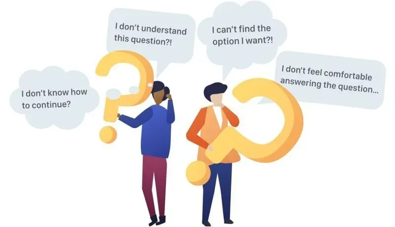
- Ask simple questions. Difficult concepts and long questions are hard to understand. They might result in the churn of your respondents.
- Be specific and don’t beat around the bush.
- Always ask only about your respondent’s opinion. Don’t ask what others think.
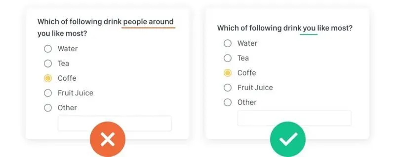
- Don’t use hypothetical questions like “what would you do if…”. On hypothetical question, you’ll only get a hypothetical answer.
- Have an option for everybody. If you’re not sure whether you listed all options, use an “other” option with an empty input field.
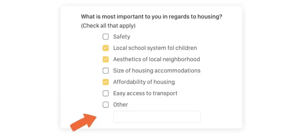
- Avoid suggestive questions. Your goal with a UX Survey is to find out the truth. Not to confirm your previously existing beliefs or biases.
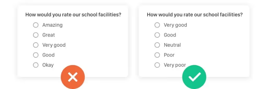
- Avoid sensitive topics if not necessary. Touching God, politics, partnerships, multi-gender lifestyles, family, or income might result in an unpleasant situation.
- If possible avoid open questions. They're hard to analyze often lead to no conclusion. I'm always trying to have at least meritory questions closed.
- Don't change scale orientation. In case more questions are utilizing a Likert scale or other rating scales, don't change the scale direction. People get easily confused.
4. Remove All Unnecessary Questions
When you have a decent set of questions, it’s about time to throw away the useless ones. Every question in your survey should contribute to the goal that you’ve set at the beginning. Many times when I’m asked to give feedback for a UX survey, and I ask for the purpose of each question, I get the following reply: “Hmm, I was just interested in it.” or “I saw a similar survey and this question was on it… So I added it.”

None of these are a good reason to have a question in your survey. If the question does not help you get closer to your goal, it has no business being in your UX survey. Every extra irrelevant question simply lowers the chance of completion for the participants of your questionnaire.
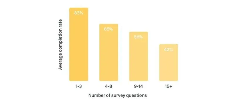
The impact of the number of questions on the average completion rate. [5]
5. Ask The Right Question In The Right Moment
It’s important not only to ask good questions but to also ask them in the right moment. Think about your questionnaire like any other interface/system in which a user interacts with it. When you first meet with your new neighbor, “What’s your salary?” certainly isn’t the first question that comes out of your mouth. In fact, without a valid reason, there’s a good chance that you might never find yourself asking that question at all!
When it comes to a questionnaire, I’m always trying to start with the most interesting question to grab the respondent’s attention. It’s also called a hook question. After this hook question, you might continue with the rest of the key questions that are necessary for the validation of your hypothesis. It helps when you order the questions in a logical groups or in a way the tell a story.
The most critical questions should come with a control question to help validate whether or not the user is consistent in their opinions. It’s well known that people are notoriously bad at telling the truth.

Always visible progress bar while completing UX survey on typeform.com
Throughout the survey, you’re building trust and you’re forging a relationship with your respondent. The most sensitive and “boring” questions (like screening and demographics) should be placed right at the end of the questionnaire. Don’t forget to ask for each user’s email address. It’ll help you verify that a user is a real person and it’ll provide you with a contact in the event that you need to clarify some responses or if you want to invite the user for an additional interview.
6. Find The Right audience
The respondents of your survey should always be determined to answer by the survey objectives. When you’re examining eating habits of primary school children in eastern Europe, it doesn’t make sense to ask mid-age male adults from Asia. There are many ways to find an audience for your UX survey. I’ll mention 3 which worked best for me in the past and 1 that brought me very poor results.
✅ Ask Your Own Users
If you already have a product with a user base, don’t hesitate to ask them to participate in research. There isn’t a better and more relevant audience! Moreover, people love to occasionally contribute to the development of a product they like and your brand benefits from it because your customers see that you care about their opinions.
✅ Forums and Facebook Groups
If you’re starting a new product/service and don’t have customers yet, Facebook groups and forums might serve as a good starting point. Find groups which are thematically close to your business and survey their members. Before posting any questionnaire, always talk to the moderator first! Otherwise, you might violate their terms and damage your brand.
✅ Fake Door Landing Pages
When your product/service is not on the market yet or if you want introduce a new feature for a different audience than your current users, you can try to obtain your respondents through Fake Door Landing Pages. Create a one-page site that briefly describes your new business and asks visitors for their email addresses. Run a Facebook campaign to promote this page to your target audience. Then, survey those people.
The first and foremost important reason for the development of any new product is offering new value to the customer. For that, you have to clearly understand your customer needs and the best way to identify their monumental pain point is by using the kano model.
❌ Don’t Buy Research Panel Users
Remember, real insights come from real consumers. While buying panel users might seem easy, the results are often not based on reality. Participants recruited from these agencies in many cases do not fit the right target group and/or tend to fill the form in a hurry just to get the promised reward.
Also, do not forget to calculate how many responses you need to ensure that your findings are statistically significant. This article might help you calculate your sample size.
7. Pre-test Your UX Survey
Now, when you have prepared a set of questions that will help you to accomplish your research goal and you know who your respondents will be, my last tip is to pre-test your survey before you send it out to all of your potential respondents.

Send it to a few people, maybe your colleagues, friends or family. You will not count their responses into the results, but they will help you to validate that all of the included questions are understandable, that your survey doesn’t contain any unclear answer choices, and that the UX survey doesn’t lead to a dead end. It’s better to look awkward in front of a few friends than to end up with useless survey results.
Good luck with your UX survey!

6 Techniques To Boost Revenue of Your Subscription-Based App
In 2018, global consumer spend in both Apple‘s App Store and Google Play was more than $100B, and it’s going to surpass $120B in 2019. It’s actually growing 5x faster than the overall global economy. What’s more, in-app purchases and subscription-based apps are becoming standard amongst the mainstream population. Almost 50% of US millennials made at least 5 in-app purchases last year, and when it comes to the most grossing apps, the TOP-5 of them are monetized through a subscription-based model, where users continuously shell out money. [1][2]
It’s safe to say that people are willing to spend their money on (and in) mobile apps of all kinds, and app makers are doing their best to show-off features and optimize conversion funnels. And as it turns out, the subscription model is one of the safest ways how to survive as a software company. In this article, I will share with you a few techniques that helped companies I worked with to increase their subscription-based revenue.
Worldwide App Store Consumer Spend in USD (Billions) [1]
There are 2 ways to increase the revenue of your subscription-based app:
1. Growing the number of Subscribers
The most important metrics for your sales funnel and growing your subscribers are the sales page conversion, install to trial conversion, the average time from install to trial, and trial to paid conversion. Also, pay attention to your other product metrics — e.g. aggressive in-app communications might have a negative effect on your user retention, even though it slightly increases the conversion to trial.
When you’re making any type of change in your conversion funnel, always measure the impact and evaluate exactly how each adjustment influenced your metrics. For sales funnel experiments, I’d recommend using A/B tests because they help to ensure that there is a level playing field for every variant. This will help to minimize any external influences that could skew your results. In addition, always test just one change at a time to help pinpoint the specific changes that had an effect.
In-App Sales Page
For app monetization, the in-app sales page is a centrepiece and it’s certainly the most important part of your in-app purchase funnel because it leaves the biggest impact on your sales numbers. That’s why I start here, and you should too.
The key to selling your product is to first understand your customer needs and second, explain how your product can solve them. The most effective way for learning your customer's needs is to use the Kano Model. When you know it, clearly state it in 3–4 points. Avoid providing too much information; people are sick of long reads. Tell your users why they should purchase your subscription and give them information on how it will improve their experience instead of just providing the list of features that they’re buying. Focus on the positives — users pay for better service, not the removal of annoying features.
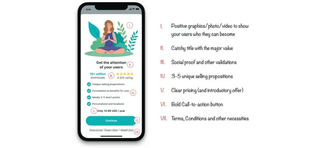
For Spendee, which is one of the apps we build at Cleevio, just a clear explanation of USP and explicit trial statements helped them improve the sign up to start trial conversion for 20%.
In the event that your app offers more than one subscription-based plan, make sure that you’ve clearly explained the differences between each and told your users all about the individual benefits and limitations (if any) of each model. As William Hick famously found, the more choices you present your users with, the longer it takes them to reach a decision on which one to interact with. If your app contains more than 2–3 different subscription plans, think about simplification. Here is a case study on how Groove increased its trial signups by 358% by simplifying its pricing.
While an annual plan might be great for your cash flow and revenue predictability, such a long commitment might seem scary to your customers who still don’t know your app very well just yet. At first, it might be beneficial to provide them with additional billing options (monthly or quarterly) and highlight how much they can save on the yearly option. Another way to reduce the initial friction is through introductory offers.

Introductory Offers
The purchase decision-making process is difficult, and it‘s often guided by irrational thinking and emotions. Introductory offers are a great way to mitigate insecurity and give your users an extra logical argument for trying your product. With both Apple‘s App Store and Google Play, you have basically 2 options: Free Trial and Introductory Pricing.
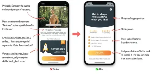
With Free Trial, you offer your customers a short period of time (typically 3, 7, or 14 days) when they can test all the subscription features for free. A premium first-time experience helps to engage people and hook them.
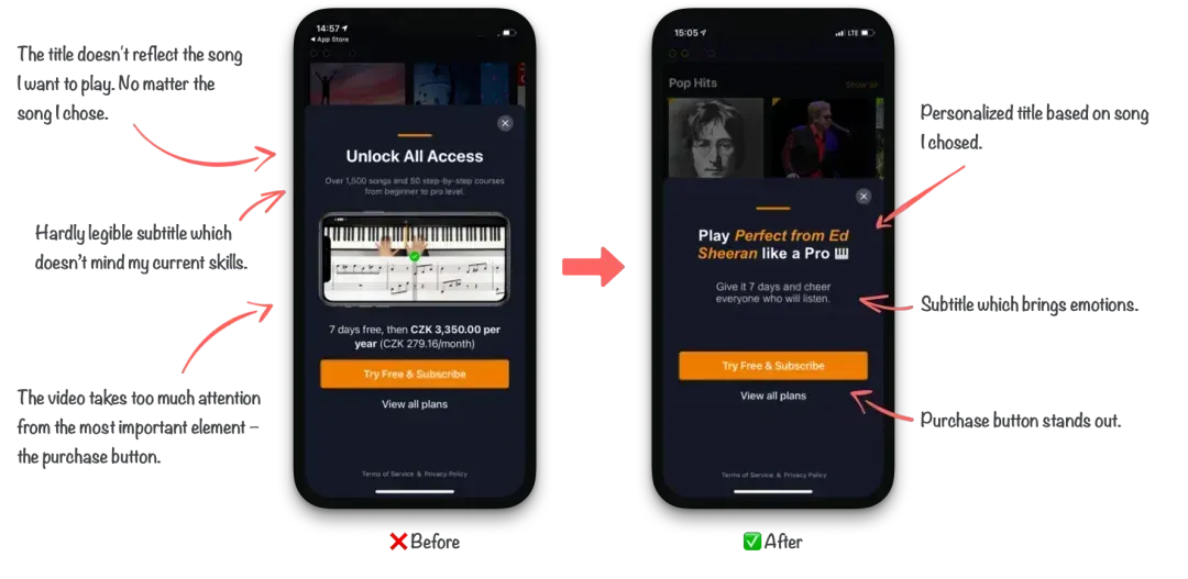
Introductory Pricing allows you to present a special pricing offer at the beginning of the subscription-based cycle (e.g. first 3 months for $0.99, then $2.99/month). This offer might be especially useful if your customers need more time to understand the value of the paid plan that you’re looking for them to purchase. In addition, it might also attract early price-sensitive customers, who will be enticed to purchase your app through an introductory price first. The goal is to entice them to purchase the subscription after using and enjoying the features of your app.
Great introductory offer examples from Sleepzy, 30 Day Fitness, and Runtastic.
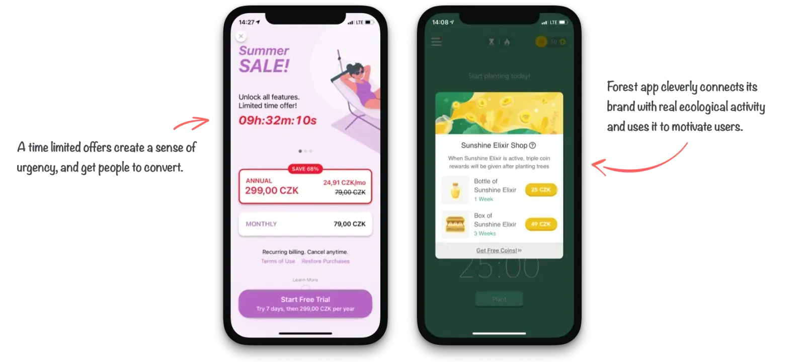
Territorial Pricing
The Law of demand states that when a product decreases in price, it leads to an increase in demand. Elasticity describes just how big this increase in demand is. The important learning lesson to take away here is that if the demand is like a piece of elastic, a relatively small drop in price can multiply the demand, and result in bigger revenue. [4]
Elasticity depends on many variables. One of them is purchasing power parity in a particular country. If you provide the same price for your subscription-based app all around the world, you might compete with a cup of coffee in one country, while in other countries, people survive a few days for that amount of money.
Try several price experiments in different countries and figure out what your price elasticity looks like in each of them. In some countries like the US, Australia, or some north European countries, the price for your subscription-based service might be 2–3x higher without any significant drop in units sold. On the other hand, countries like India, Thailand, or eastern European countries might generate much higher total revenue if the price of your app shrinks by about half.
Average purchasing power parity by country (GDP per capita, Int.$) [9].
Make The Process Effortless
Don’t expect your users to search for the in-app purchases. It’s always best to present them with your subscription-based plan as soon as possible and ask them to subscribe. Some good options would be to present them with a subscription introduction after they start using the app, place a persistent “subscribe” button that remains visible on the home screen, or design a subscription section in an account or app settings menu. In my experience, the offers that appear in the moment when a user shows interest in a premium feature often generate great conversion rates.
Reduce the friction and all unnecessary steps needed to subscribe. The subscription flow should be as straightforward as possible. All additional user information (demographic info, reasons for use, etc.) might be obtained later. Based on Apple’s research, subscription-based flow with 3 clicks has around a 61% success ratio. On the other hand, a 4-click flow already drops to 48%, and long flows with more than 8 clicks are actually completed only by around 7% of all users.
2. Retain Subscribers
Acquiring a new subscriber is just one part of the journey when it comes to subscription-based optimization. The other equally important part is retaining subscribers. With a high churn rate, it’s extremely difficult to establish a sufficient Monthly Recurring Revenue. It’s 5x more expensive to acquire a new customer, as to retain an existing one. At the same time, increasing paying customer retention rates by 5% increases profits by 25–95%. [5]
“It’s 5x more expensive to acquire a new customer, as to retain an existing one.”
The important metrics for your retention strategy are your day-1 retention rates, as well as the retention rates of paying users between months 1–3 after launch, the average revenue per user / per paying user, and user lifetime value. It’s also important to care about your other product metrics, like how users interact with paid features, how much time they spend in your app, how strong your competitive advantage is, and your overall product experience. Also pay attention to your customers‘ satisfaction rate and app reviews.
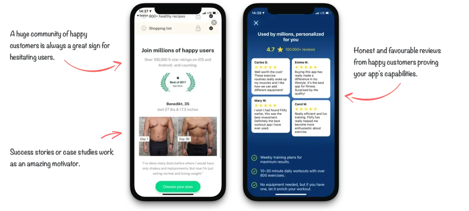
While the product itself has the biggest impact on retention and it’s certainly a real challenge to create a truly engaging product, there are certain ways to reduce the churn rate of your paying customers. There are 2 kinds of churn: voluntary (when your customer consciously cancels the subscription) and involuntary (when the subscription is interrupted due to other circumstances).
Involuntary Churned Subscribers
When a new subscription-based period occurs for your customers, there is a slight chance for the payment to be declined. It’s mainly caused by outdated payment information, or simply because the bank declined the transaction. In my experience, around 20% of transactions in the EMEIA region and around 10% worldwide are declined each month for that reason.
To prevent involuntary churn caused by payment processing issues, both Apple‘s App Store and Google Play allow developers to set up a grace period. It simply gives your subscribers some extra time (typically 3–7 days) to update their billing information and/or the bank to process the transaction. During the grace period, your customer can still use all the subscription-based features and their experience is not compromised. Google claims that developers who use a grace period see a 57% higher recovery rate from renewal declines.
Number of days in grace period after which the subscription was recovered
Take action and help your customers resolve the issue. With realtime server notifications, you can immediately gain access to the information that someone gets during their grace period and begin a helpful dialog using in-app messaging or notifications. Explain the situation and offer the deep-link to account settings where that particular user can update their billing information.
Voluntary Churned Subscribers
The best way to get back voluntary churned subscribers is to discover the reason for cancelation and then fix it. It might be anything from technical issues, price level, or bad customer support, to features fits and bad overall app experience. Without fixing the major issues, you’ll probably never be able to retain a significant part of your new subscribers.
Find out the major issues of your app by sending out a cancelation questionnaire to users who churned. The insights from this survey will help you create a strategy to retain your current customers. For your Play Store customers, you get a basic survey for free and you’ll find results in your Play Console. In the case of App Store customers, you’ll have to manage it by yourself. Here are some tips on how to get the most out of exit surveys.
For those subscribers who are leaving because of the subscription cost, if they found an alternative, or if they simply don’t use the app enough, a win-back strategy might be worth it to try. Both Apple’s App Store and Google’s Play Store have tools that allow you to create a special price offer for those users who churned recently. Your goal shouldn’t be to win-back all churned customers; in fact, it should only be to win back all profitable customers. Find out who they are and personalize the communication based on the features they use and might miss.
A great example of Win-back Offers from Noted, and HoppyGo which is an app build at Cleevio.
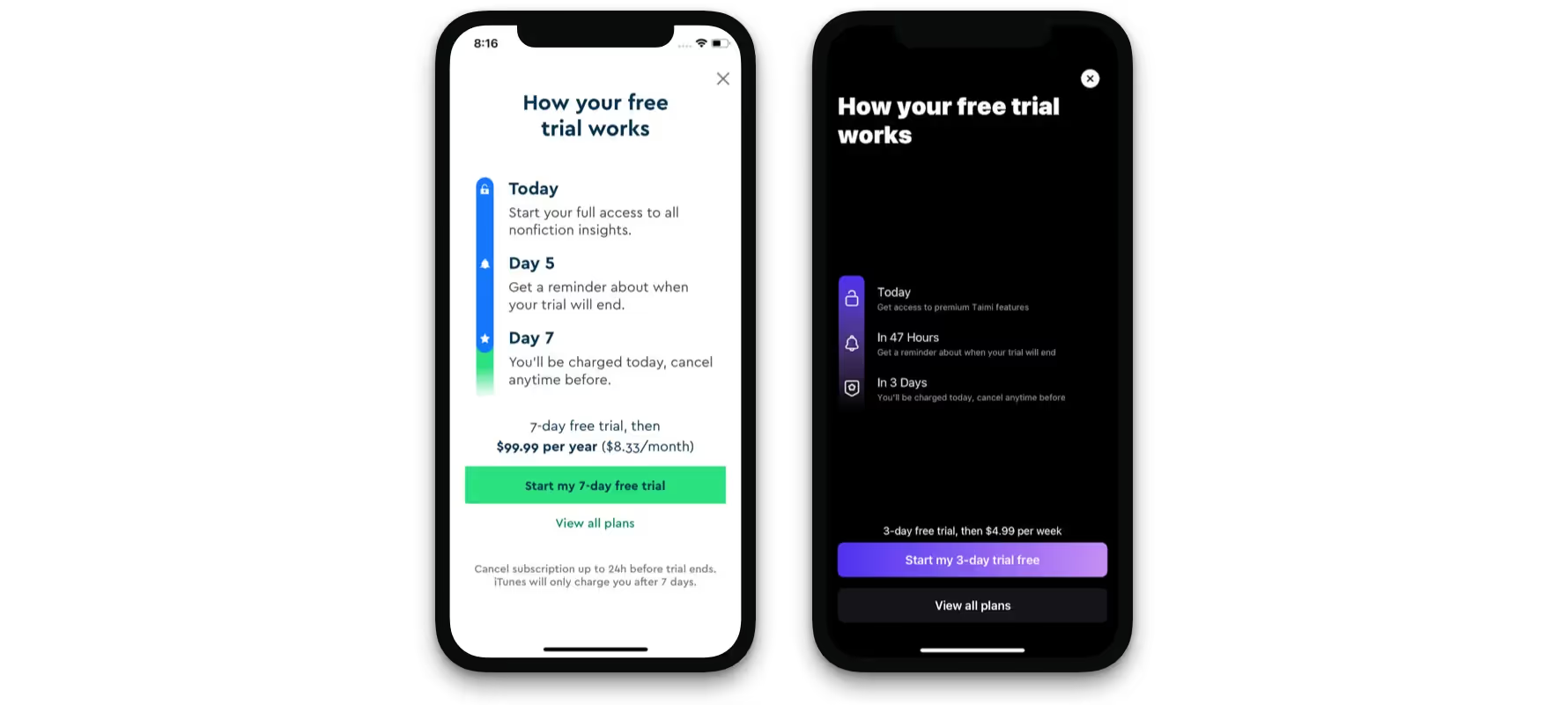
Conclusion
With the enormous growth rate of mobile app industry revenue in past years, subscriptions-based apps are a great opportunity to grow your app’s business. Both the App Store and Play Store offer features that can help you to optimize your retention funnel and acquisition strategy.
However, the decision is up to you. Start with your product’s retention — it’s much cheaper to retain a customer than acquire a new one. Then continue with the low hanging fruit — small adjustments with the biggest potential to impact your revenue. Don’t forget to document each attempt and evaluate your results. And most importantly, don’t give up. Sometimes it needs dozens of experiments before you find the gold vein.
How to Build an MVP In Agile
In a trial-and-error world, the one who can find errors the fastest is the one who wins. Some people call this approach “fail fast”. Eric Ries called it Lean, while Kent Beck and other software developers called it Agile.
Whatever you call it, the point is to find out which of your assumptions regarding the product are wrong by getting feedback from real users as quickly as possible.
The agile methodology presupposes dividing the product development into sprints, which allows to reduce risks and respond to required changes quickly.
Because the agile methodology is built around the idea of an iterative process based on customer feedback, the MVP plays a central role in agile development.
Building a Minimum Viable Product (MVP) helps to deliver a new product with sufficient features to satisfy early adopters, which allows getting valuable feedback, and building a complete set of features later on.
The MVP concept is mostly practiced in the software industry to check the viability of the product. If you looking for a company to build the MVP for you, check out this software development comany.
What is a Minimum Viable Product (MVP) and why do we use Agile?
The majority of the software today is developed using Agile methodology. In the Agile environment, you'll often hear the phrase minimum viable product (MVP).
This term simply means: the most minimally featured thing you can build that will address the opportunity well enough for most of your target customers and validate your market and product.
In other words, if you were to think about the core function you're trying to let customers accomplish, what's the simplest product you can build that lets them achieve that goal?

For example, let's say you went back in time and were working on the first version of an app for a newspaper. The core function of an app would be informing its readership. That is why the easiest product you could build would be a list of news headlines and a button to refresh.
Again, the key to successful MVP is focusing on the core value that the app provides, which is fresh news, rather than spending your time building additional features of the app.
Note that MVP doesn't mean the product should be bad. The truth is that it should be very good at what it does, but it should focus on doing only a few core functions.
In a nutshell, the main characteristics of MVP are:
- It has enough value that people are willing to use it or buy it initially
- It demonstrates enough future benefits to retain early adopters
- It provides a feedback loop to guide future development
Why should you use an Agile methodology to develop the MVP?
A key differentiator between Agile and other methodologies is that Agile leverages MVPs. With an Agile approach, you build the simplest thing you can, gather data about how customers use it, and then refine the product if needed.
This will let you work quite effectively, building only the features customers want and will use rather than wasting time building things customers don't care about.
Contrast this with non-MVP-based approaches to product development. Using other approaches, you may end up spending lots of time trying to build the “perfect” product with every feature you can imagine, but once it's out in the real world you discover that customers don't use half the features you thought they would.
Here is the agile minimum viable product (MVP) example:
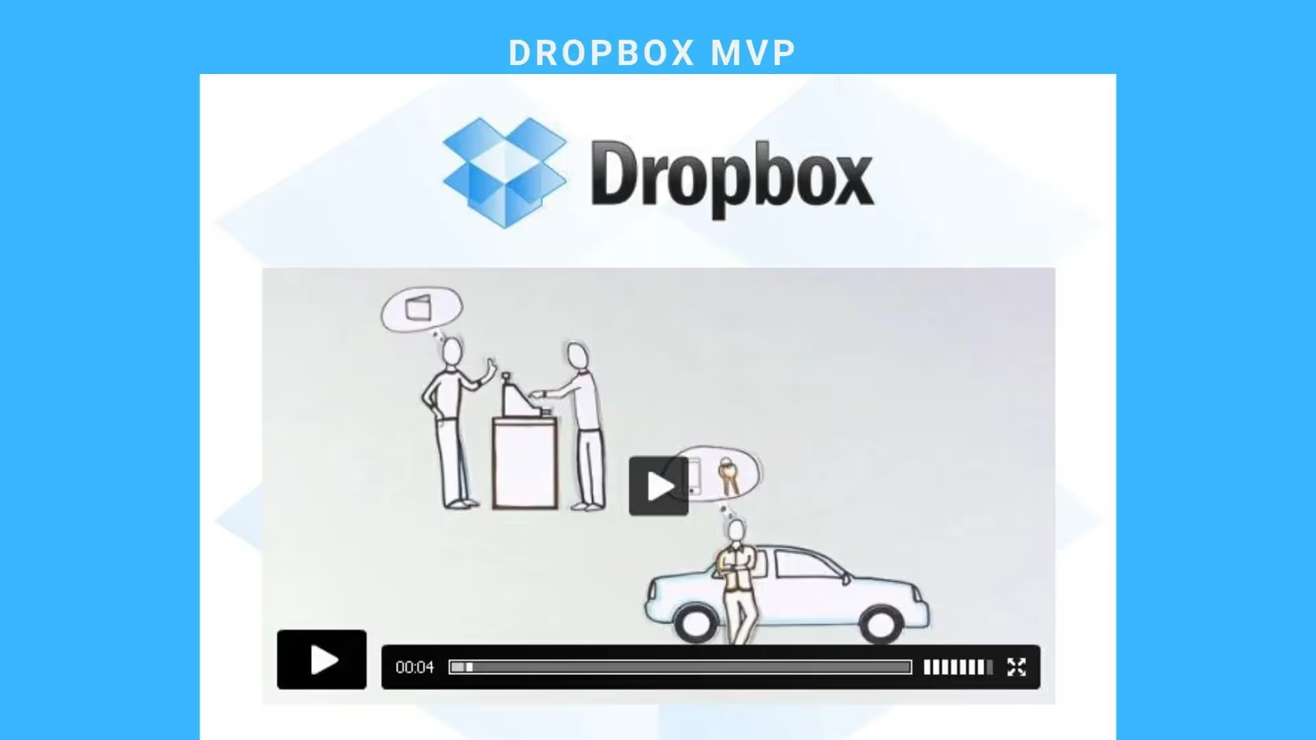
Source: Dropbox
Drew Houston - the CEO of Dropbox, decided to create an MVP for the cloud-storage startup in the form of video.
They made an explainer video and shared it with their network to gauge people's reactions. The 3-minute video explained what the Dropbox is and demonstrated how it would help people.
After releasing the video, the company increased signups from 5,000 people to 75,000 overnight for the "early access" - all of this without having an actual product.
So the main benefits of building the MVP (agile) are:
- Initial Consumer Research
As faster the product reaches out to the target user, the sooner you get the feedback and analyze the customer's challenges or preferences. If the users do not find your MVP valuable, you have space to pivot and test the other value propositions.
Or, if the opposite is true, you'll be sure that developed features are useful for target clients, so you can move forward. In the worst-case scenario, you can freeze the project to cut your losses.
- Testing Stage
The biggest benefit of developing an MVP is that it allows testing various business models and concepts.
By offering the core set of functions rather than a feature-heavy product, you can verify if their product concept resonates with your business model, providing an opportunity to change a product’s direction based on findings.
Unlike feature-heavy products, when the MVP is launched, you will have the ability to identify what types of social groups are the most active users, how they interact with the product, and how you can monetize it.
- Cost Efficiency
The quality products are the result of years of development, with an appropriate price tag. But because these products were created iteratively over a longer period, the cost is spread over time.
The MVP approach also helps to save by preventing the product from becoming over complicated. As the product starts getting more traction and gathering more information regarding the direction the product is moving to, you can increase or reduce your investments.
If you're interested to learn more about Agile and SCRUM methodologies, we recommend to you that you check out this articlefrom the SCRUM Institute about how to become a SCRUM master in a detailed step-by-step process. They also offer the most popular, and the most economical Scrum Certification Programs globally.
The Process of Building the MVP (Agile)
Now, once you know what is an MVP, why it is used in Agile, and what are the benefits of it, let's have a look at the 6 steps required for building an MVP.
Step #1: Identify What Problem You’re Solving and For Whom
When developing a version of new products most people aren’t sufficiently rigorous in defining the problems they’re attempting to solve and articulating why those issues are important. Without this process, the product may miss opportunities and waste resources. That is why you need to become better at asking the right questions so that they tackle the right problems.
Take a look at your product idea and ask yourself:
- Who’s your target audience?
If you get stuck at this stage, try to identify your personal challenges. Is there anything you would be able to do better if you had the right tool?
- Why does your target audience need this product?
This will help you identify the main goal of your product and the solution to your potential customers’ needs.
- In what situation would they use it?
Source: Metabeta
Note: In the process of identifying the answers to the questions above it is important to keep everything real and do time and cost estimates in addition.
Step #2: Analyze Your Competitors
As soon as you figured out what problem you are solving, it’s time to see how other companies are solving this issue – or at least trying to solve it. At this point, it is obvious that you have to conduct a competitor analysisif there are similar products on the market.
You should also keep in mind that even if you don’t think you have any direct competitors, your faith in the uniqueness of your product will ground for confidently bringing your product to the market.
Step #3: Define The User Flow, Wireframe & Design
Defining the user flow for your future product involves you focusing directly on your primary goal. In order to define the main user flow, we should first define the process stages which is actually easy because all you need to do is explain the steps required to reach the primary goal of your product.
At this point, you shouldn’t think about features – but should focus on basic tasks such as types of goals that your end users have when they use your product, their expectations, etc.
Once you’re done with defining the user flow, you can move on to wireframing, which is simply an illustration of a webpage or an app. A wireframe is a layout that articulates what kind of interface elements will find a place on important pages.
Wireframing Example:
Designing the User Interface (UI) brings together concepts from interaction design, visual design, and information architecture. Here, you should capitalize on what you learned in the previous phases in order to produce an experience that will surprise and delight the end-user.
Here at Cleevio, when we have the first prototype ready (usually clickable mock-up) we do user testing. User testing is essential to the success of the new app. When we have the results of user testing ready we iterate the wireframes and re-test them on the users.
After the wireframes are tested you should move on to the design phase which should be different for each platform (iOS, Android, Web,...).
Step #4: Analyse Your Features
Did you know that more than 45% of features built-in software products are rarely or never used?
Now that you’ve created your user flow, you can start creating a more detailed list of features for each particular stage, but keeping the statistics in mind.
Once you’ve laid out your features for each stage, you will need to prioritize them. What is the most important action you want your users to complete? This will be your main feature.
One of the feature prioritization methods is MoSCoW which is used to decide which functions to complete first, which must come later and which to exclude. Another technique used for measuring the necessity of the features is based on the business value (time to develop vs. nice to have vs. costs)
Source: ProductPlan
Step #5: Development & Testing
Now that you know the features of your minimum viable product (MVP), it’s time to put them to practice. Moving to the development stage, you need to test your product and work to improve its quality.
After approval of the Wireframes, you should start working on the setup architecture, database and start developing API, Administration, and all back-end.
Alpha and beta testing can help here as some of the most popular ways to test a product’s performance in different scenarios. Make sure to align the testing and only make the changes that affect the entire user experience.
As standard, you should implement the following tests in a controlled environment before the app is launched:
- Functionality Testing
- Usability testing
- Compatibility testing
- Crowd Testing
- Interface Testing
- Performance Testing
- Security testing
During the development process, you should continuously test all the implemented features.
For example, here at Cleevio, we build mobile apps, and releases of beta builds are uploaded to Google alpha/beta testing and to Apple's TestFlight. Internal test builds are in Appcenter (an official tool by Microsoft).
When the "release candidate" (a product that's ready for the market) is ready we do open or closed beta testing, where we invite as many relevant users into the beta test program and we gather feedback on functionality and bugs.
Step #6: Iteratively get to product-market fit or fail
If you validate the MVP, you can start looking at your product’s scope and expand. At this point, you either raise startup capital to help you get to market faster or fail.
For a mobile app, we usually do a “soft launch” when we release the MVP to AppStore and Google Play but don't encourage any marketing of the app at this time.
As the app is getting more users some bugs can pop and we are sure to fix everything ASAP. Usually, we release new builds every other day. Once the app is stable and we have a crash-free users rate over 99.9%, we recommend to start with marketing and acquire more users.
Data is really important and that's why we recommend monitoring user's behavior with Mixpanel or Google Firebase analytics so that we can understand how users are really using the app.
The development of the product is never finished. Very important is to ask for the user's feedback and iterate the product. When we have more users we perform A / B testing to be able to test various solutions and increase user engagement.
Source: ProductPlan
Conclusion
At Cleevio we've developed over 120 MVPs in the past 10 years so we have enough experience under our belt, to know which MVPs scale and which burn and die.
We know that it's a bit overwhelming to prepare a roadmap, documentation, or wireframes for your MVP idea so feel free to reach out to us and we'd be happy to offer you some free advice.
For a consulting call about your MVP email us at hello@cleevio.com .

